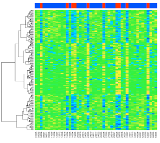
I don't recall what the exact Google search target was that turned up a post about making a heatmap of gene expression data, but it really changed my life. It lead me to these two pages describing how to do it in R (here) and Python (here), and that motivated me to get into R, as much as I've been able to in spite of all I don't like about it.
I thought I'd work on this a little bit again; it's been 3 years or so since I gave a couple of talks about this, so I'm rusty, but it'll be fun. I would recommend that you go through the original posts by Peter Cock first. I'll try to add something of my own.
Of course, it's all based on the Bioconductor project in R, and there is a very nice write-up in the original paper (Gentleman et al, PMID 15461798). I even bought the book (our library sucks), and it's pretty good too, especially if you are serious about the field.
To begin with, to motivate things, we will recreate the graphic. We need a couple of R packages from Bioconductor to do this. You could get them from the Package Installer, but I was having trouble and so I tried this:
source("http://bioconductor.org/biocLite.R")

biocLite('Biobase')

biocLite('ALL')

biocLite('limma')

biocLite('annaffy')
Note: all these lines would actually look like this in R:
> source("http://bioconductor.org/biocLite.R")
For most of the commands here, I've left out the prompt so you can more easily copy and paste them. And I'm not showing the info that's printed as the packages are downloaded and installed.
We're going to just quickly do the plots, then later I'll explain more about it. First we need to load two modules and some data:
library('ALL')

data('ALL')

library('limma')
The first command will output:
Loading required package: Biobase


Welcome to Bioconductor


  Vignettes contain introductory material. To view, type

  'openVignette()'. To cite Bioconductor, see

  'citation("Biobase")' and for packages 'citation(pkgname)'.
Next we do the analysis (I know this won't make much sense yet, but we're just making sure we get the graphic without an error):
eset <- ALL[,ALL$mol.biol %in% c('BCR/ABL','ALL1/AF4')]

f <- factor(as.character(eset$mol.biol))

design <- model.matrix(~f)

fit <- eBayes(lmFit(eset,design))

sel <- p.adjust(fit$p.value[,2]) < 0.05

esetSel <- eset[sel,]
And in the third part we plot the data:
color.map <- function(s) {

  if (s=='ALL1/AF4') 'red' else 'blue'}

patient.colors <- unlist(lapply(esetSel$mol.biol,color.map))

heatmap(exprs(esetSel),

  col=topo.colors(100),

  ColSideColors=patient.colors)
The graphic is at the top of the post.
An overview of what we've done. We filtered for all samples with one of two chromosomal translocations. In the plots, the columns from the 'ALL1/AF4' samples are red, those with 'BCR/ABL' are blue. We now have 47 samples.
> dim(eset)

Features  Samples

   12625       47
Each sample has 12625 "features"---gene expression measurements. We've done some fancy statistics and then filtered for those with p < 0.05 (correcting for the large number of measurements). In the end, we have 165 genes of interest to plot.
> dim(esetSel)

Features  Samples

     165       47
By default, heatmap does clustering and draws dendrograms, but you can turn this off. Let's turn off the column clustering only, and since we haven't substituted the real gene names, let's turn that off too:
heatmap(exprs(esetSel),

  col=topo.colors(100),

  Colv=NA,

  ColSideColors=patient.colors,

  labRow=NA)

More later on this. Our goal is to understand more about "ExpressionSet" objects and the kinds of manipulation that are possible, the second is to see how much of this we can do from Python (using rpy2), so that the code is transparent and makes intuitive sense.