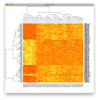
This is a brief post to explain the R (Bioconductor) code that we used to draw a heat map for gene expression data (here and here). Again, first we load the example data:
library('ALL')

data('ALL')

library('limma')
The second group of commands is:
eset <- ALL[,ALL$mol.biol %in% c('BCR/ABL','ALL1/AF4')]

f <- factor(as.character(eset$mol.biol))

design <- model.matrix(~f)

fit <- eBayes(lmFit(eset,design))

sel <- p.adjust(fit$p.value[,2]) < 0.05

esetSel <- eset[sel,]
The first of these constructs a "selector." The values in
ALL$mol.biol are factors; two of the possibilities are in the vector c('BCR/ABL','ALL1/AF4'). The result is a vector of booleans. To give a simpler example:
> vowels = c('a','e','i','o','u')

> letters[1:6]

[1] "a" "b" "c" "d" "e" "f"

> letters %in% vowels

 [1]  TRUE FALSE FALSE FALSE  TRUE FALSE FALSE

 [8] FALSE  TRUE FALSE FALSE FALSE FALSE FALSE

[15]  TRUE FALSE FALSE FALSE FALSE FALSE  TRUE

[22] FALSE FALSE FALSE FALSE FALSE
The vector of True/False values from
ALL$mol.biol %in% c('BCR/ABL','ALL1/AF4' is used to select the appropriate columns from the data, but is acting on the complex ExpressionSet object, as explained last time. The result is reduced in size.
> dim(eset)

Features  Samples

   12625       47
The second line is just a bit of coaxing. Because the mol.biol descriptions for the smaller eset were derived from a "factor" with 6 possibilities, we remove the other 4 before moving on to model construction:
> f = eset$mol.biol

> class(f)

[1] "factor"

> length(f)

[1] 47

> levels(f)

[1] "ALL1/AF4" "BCR/ABL"  "E2A/PBX1" "NEG"

[5] "NUP-98"   "p15/p16"

> f = factor(as.character(f))

> class(f)

[1] "factor"

> length(f)

[1] 47

> levels(f)

[1] "ALL1/AF4" "BCR/ABL"
The middle two lines is where the magic happens. I'm going to skip that for the moment. You can read about it in (Gentleman et al, PMID 15461798). The result is in the variable `fit`. One of its sub-objects is a list of p-values:
> class(fit$p.value)

[1] "matrix"

> fit$p.value[1:3,]

           (Intercept)   fBCR/ABL

1000_at   2.713661e-58 0.05437095

1001_at   3.001944e-43 0.24423133

1002_f_at 2.273600e-46 0.10091357

> colnames(fit$p.value)

[1] "(Intercept)" "fBCR/ABL"

> pv = fit$p.value[,2]

> class(pv)

[1] "numeric"

> pv[1:4]

   1000_at    1001_at  1002_f_at  1003_s_at

0.05437095 0.24423133 0.10091357 0.30303775
p.adjust is a correction for the large number of comparisons. You can read about it by doing ?p.adjust. I wasn't clear on which is the default method, but it's not Bonferroni.
> r1 = p.adjust(pv)

> r2 = p.adjust(pv,method='bonferroni')

> all(r1 == r2)

[1] FALSE
So we just construct a selector for those rows with p < 0.05, and again, whittle down the ExpressionSet to something manageable:
> sel <- p.adjust(pv) < 0.05

> esetSel <- eset[sel,]

> dim(esetSel)

Features  Samples

     165       47
In the third part, we draw the heatmap.
color.map <- function(s) {

if (s=='ALL1/AF4') 'red' else 'blue'}

patient.colors <- unlist(lapply(esetSel$mol.biol,color.map))

heatmap(exprs(esetSel),

col=topo.colors(100),

ColSideColors=patient.colors)
In the first two lines we construct a function called
color.map, and then use it to construct a vector of patient.colors. This is for the colored bars at the top of the plot.
> color.map <- function(s) {

+ if (s=='ALL1/AF4') 'red' else 'blue'}

>
We use
lapply to feed values to our function, but the result is a list. So we use unlist to extract what we want.
> values = esetSel$mol.biol

> values[1:4]

[1] BCR/ABL  BCR/ABL  ALL1/AF4 BCR/ABL

6 Levels: ALL1/AF4 BCR/ABL E2A/PBX1 ... p15/p16

> colors = lapply(values,color.map)

> class(colors)

[1] "list"

> colors[1:2]

[[1]]

[1] "blue"


[[2]]

[1] "blue"


> patient.colors = unlist(colors)

> patient.colors[1:4]

[1] "blue" "blue" "red"  "blue"

> class(patient.colors)

[1] "character"
We draw the heatmap with the command:
heatmap(exprs(esetSel)
All the rest is eye candy. In particular, we use the
topo.colors. Without that, we get the default.

With the topo.colors, we would get colors as in the graphic at the top of the post.
heatmap(exprs(esetSel),col=topo.colors(100))
The last argument to heatmap gives us the bars on the columns to identify the sample by translocation.
We've explained everything but the actual statistical model fitting. That's for another time.